Everything in this cover is done wrong:
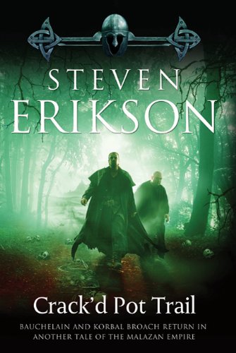
– Bauchelain (the one in the center) is described in the book as a lean, angular guy. Like someone you’d find in a library, and not like a bulky warrior. This one was more fitting but it looks like he put on weight.
– It’s not an easy book to sell, this one. It’s even worse when the cover gives bad expectations. Nothing in the cover refers to something in this book. The green hue isn’t even close to the kind of tone the story could have.
– The forest makes no sense. As far as I remember there are no trees in all the book, and for the most part they move through a barren land/desert.
– What’s written under the title is unacceptably misleading. This story has no connection whatsoever with the “Malazan Empire”. It’s so wrong that it’s not acceptable even as a vague cover blurb. It’s just completely false.
– I really dislike this new habit of using real pictures or 3D art for fantasy books. There are so many valid illustrators out there. Use them.
In general, it’s very bad when your publisher has no idea of what he’s publishing.